Branding – Totems
Role: Graphic Designer | Institution: The Community Plant Variety Office – EU Agency
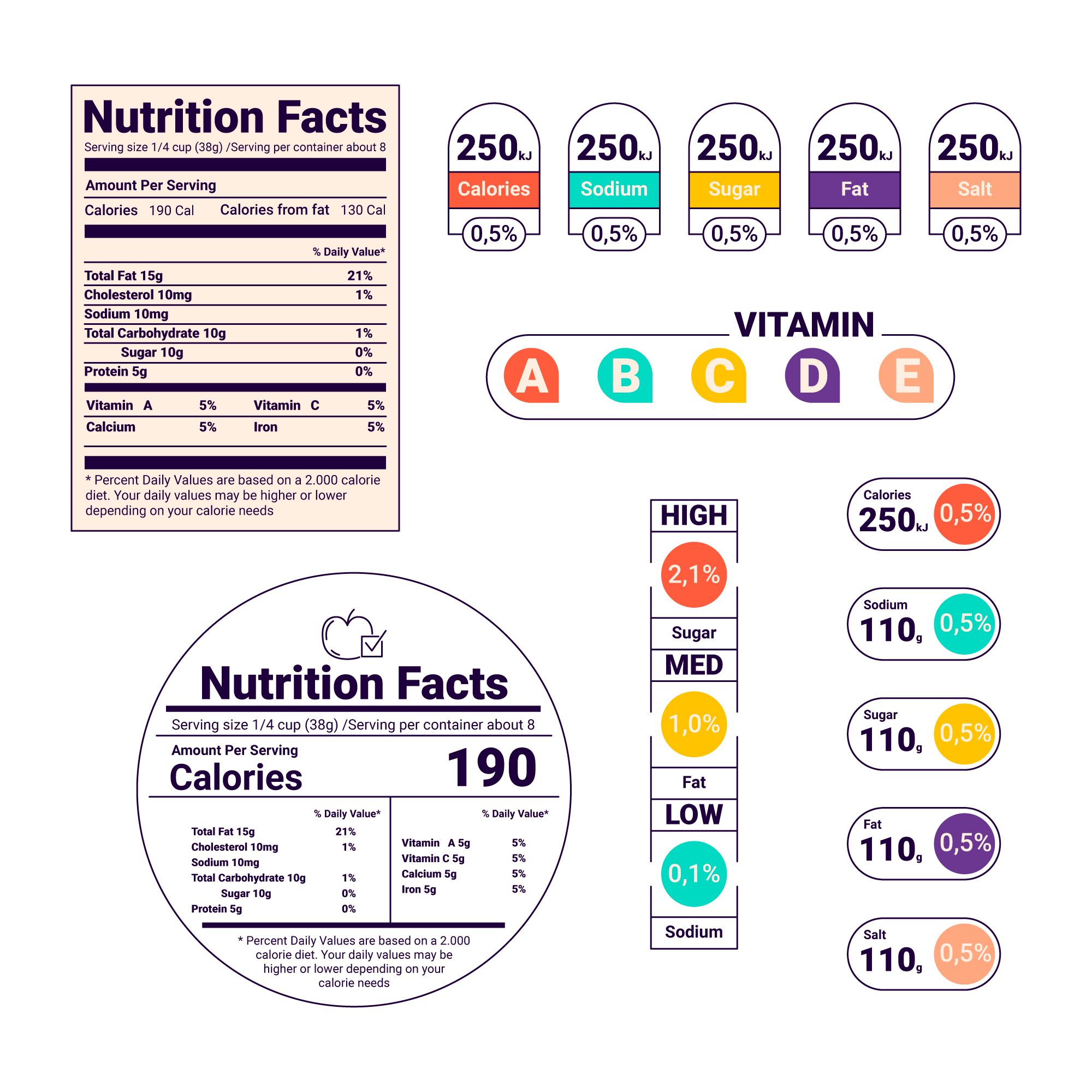
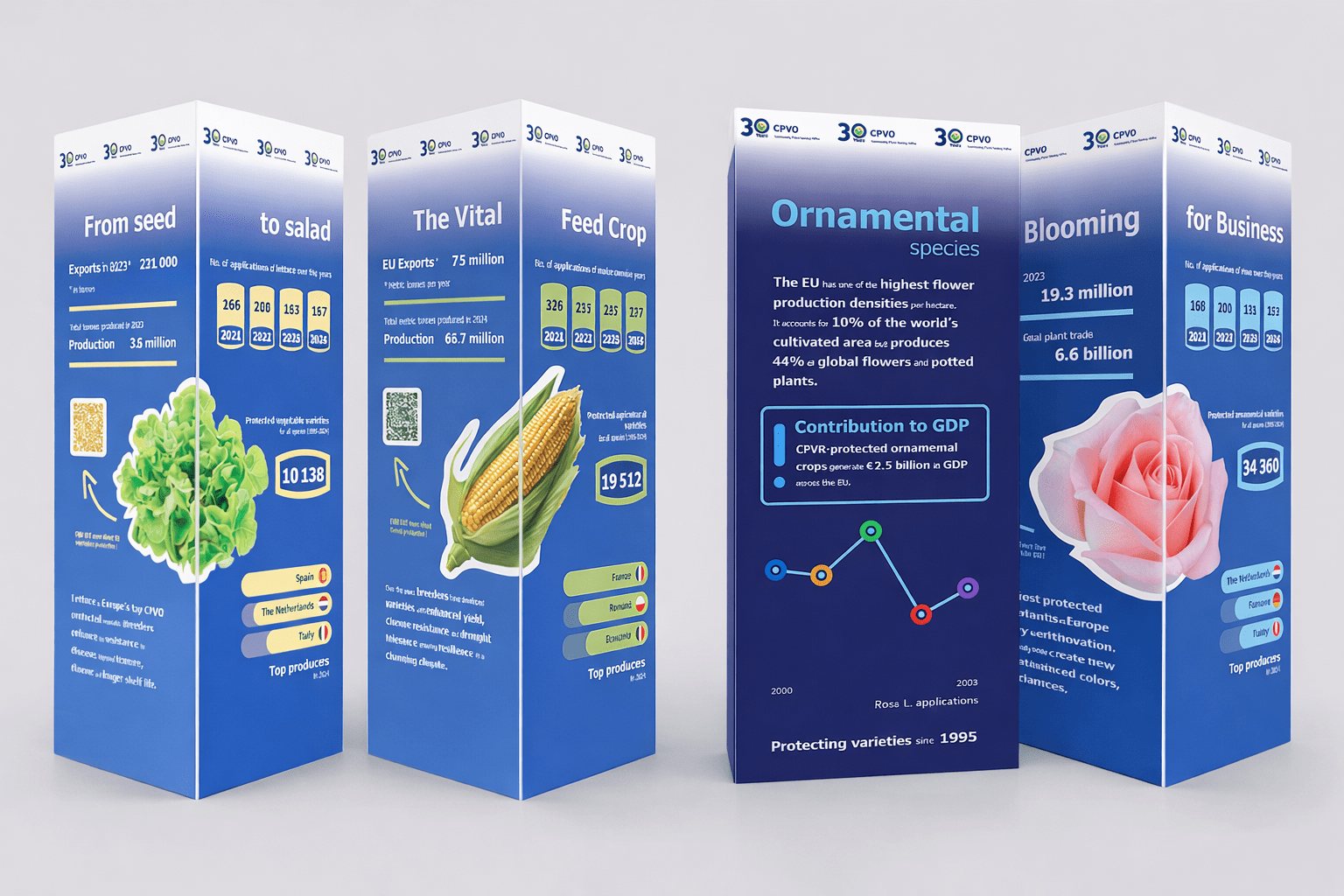
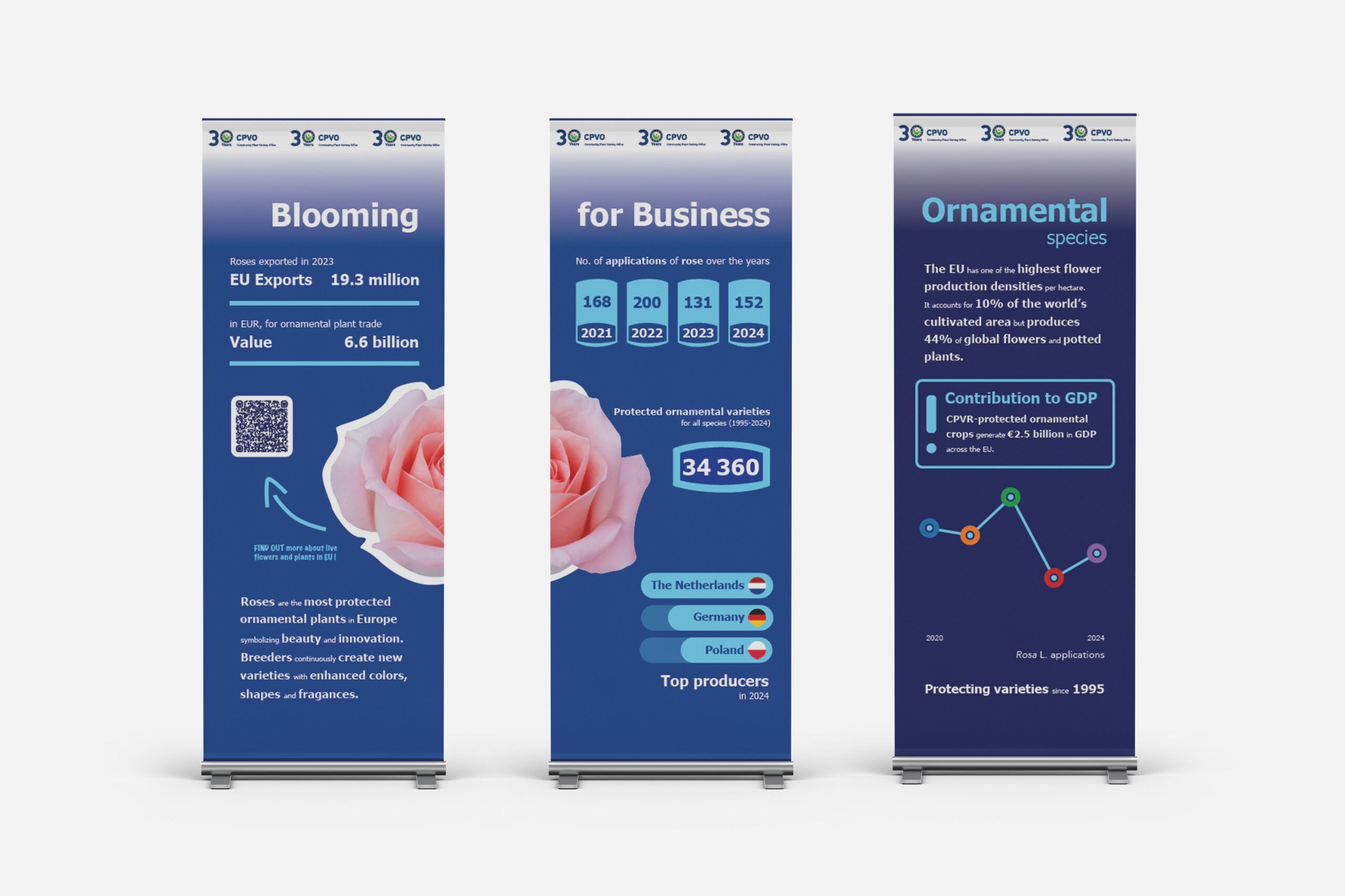
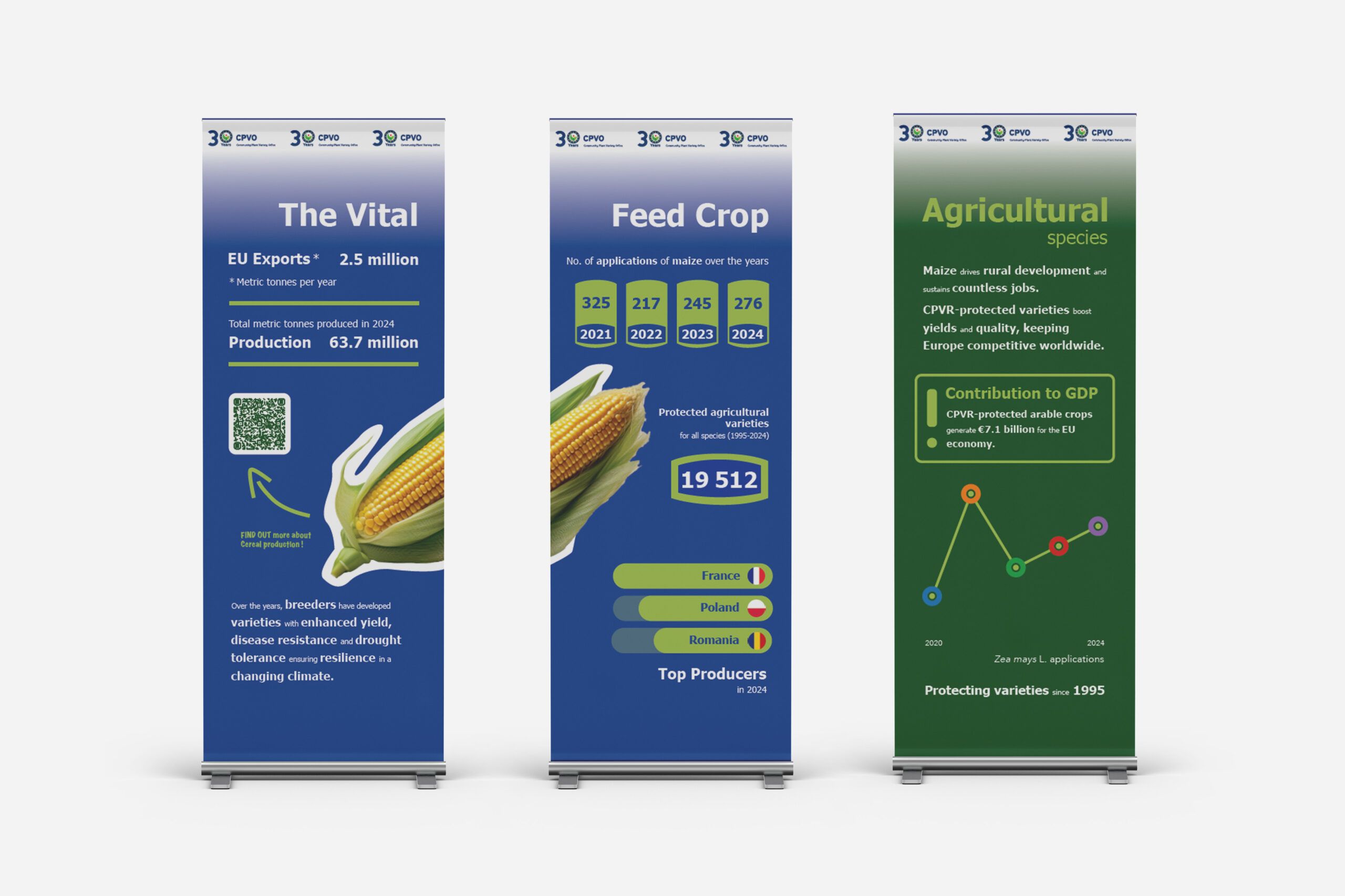
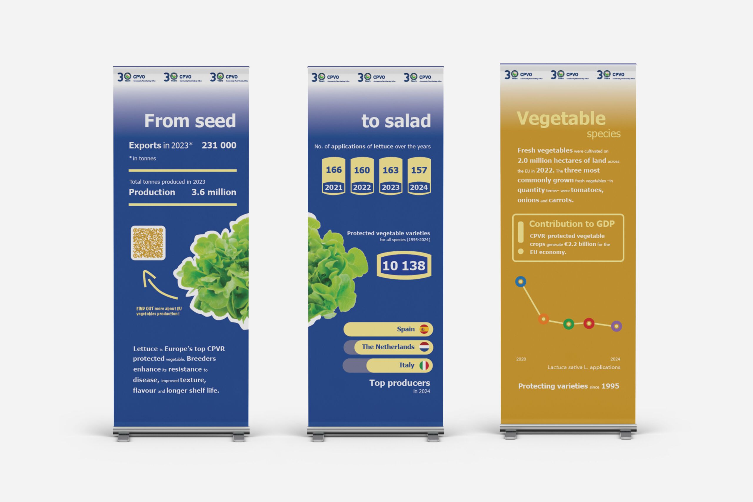
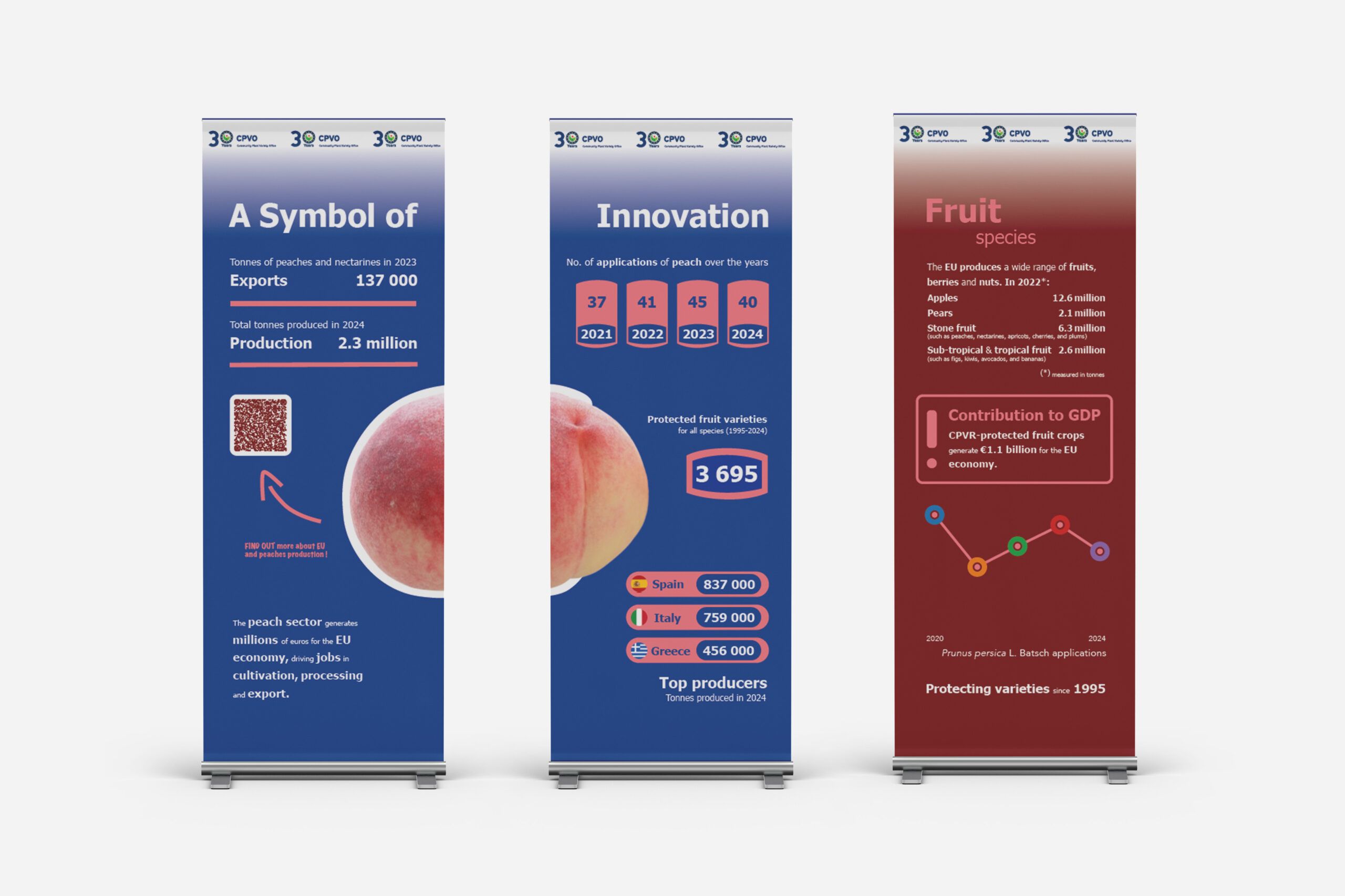
Print design for the 30th Anniversary of the Community Plant Variety Office. A series of three-sided totems representing four main crop categories, using a color-coded system and an infographic language inspired by nutritional labels to translate complex data into clear, easy to understand infographics.
Specifications
Each category (ornamental, agricultural, vegetables, and fruit) is identified through a distinct colour system, reinforcing its individual character and improving visual clarity. The visual language is inspired by nutritional information labels found on food packaging, translating complex data into a clear, accessible, and intuitive format.
Goal
This approach aims to simplify technical content through a familiar graphic code, making information easier to understand while maintaining a strong visual impact.