Editorial Design – Illustrations
Role: Graphic Designer, Illustrator | Client: Independent Author
Main Challenge
Translating introspective, personal texts into a visual system that supports reflection without overwhelming the content. The design needed to balance expressive elements with restraint, using layout, illustration, and pacing to create moments of pause and engagement.
Results
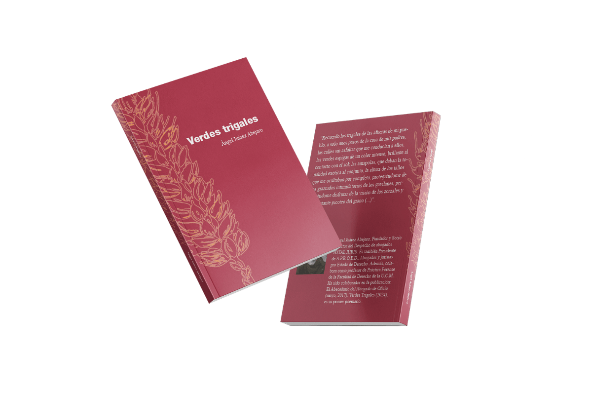
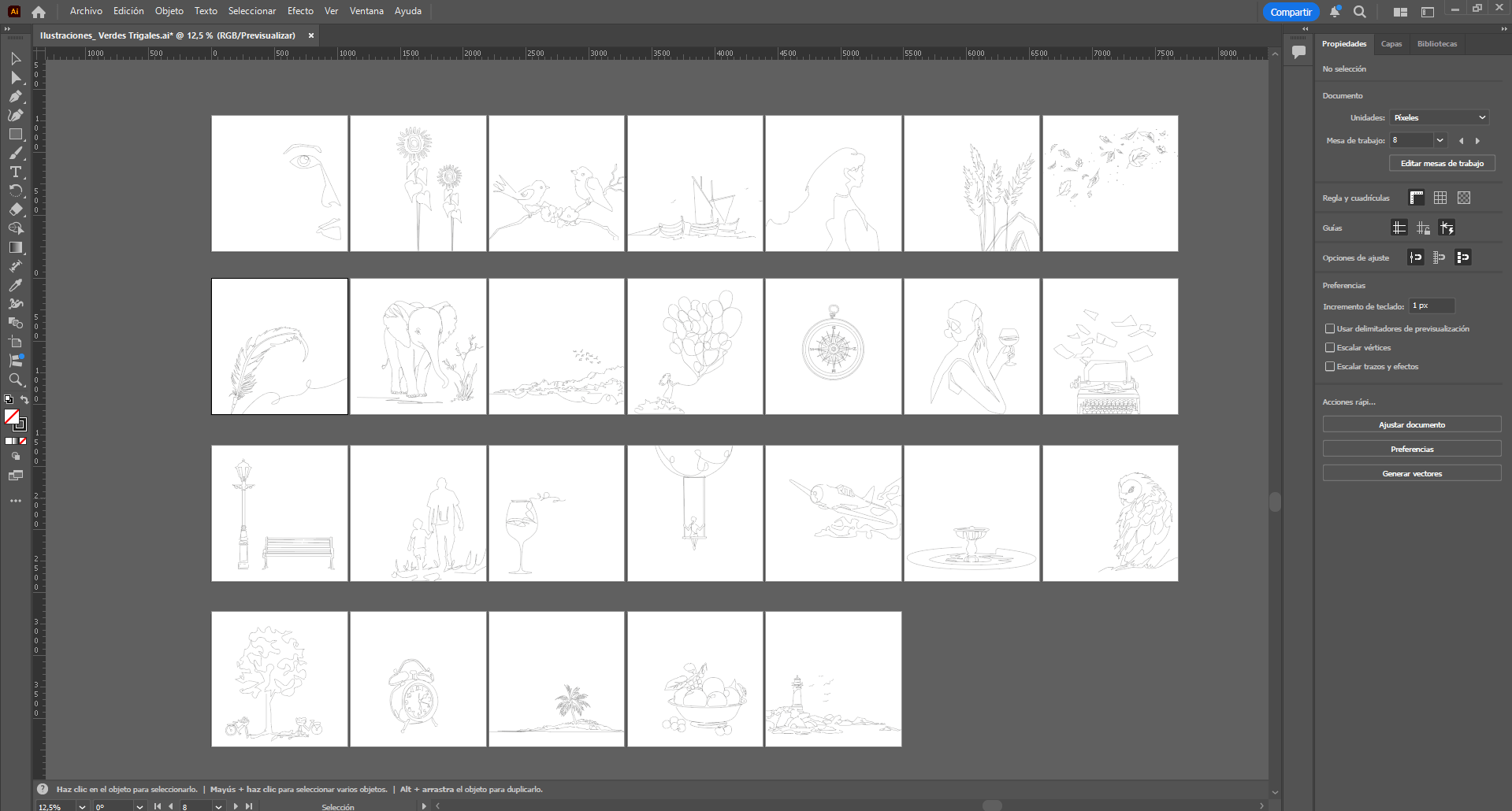
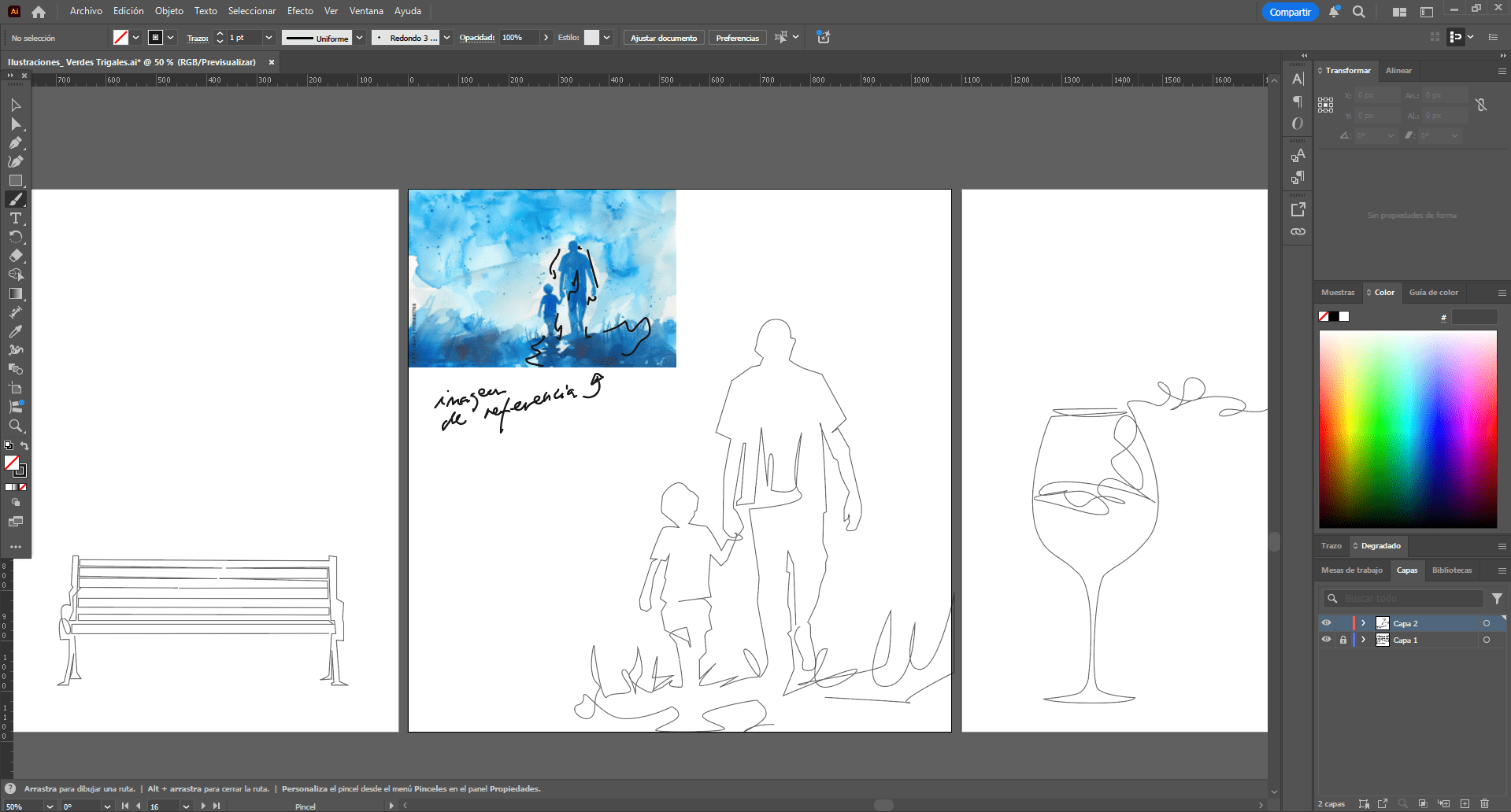
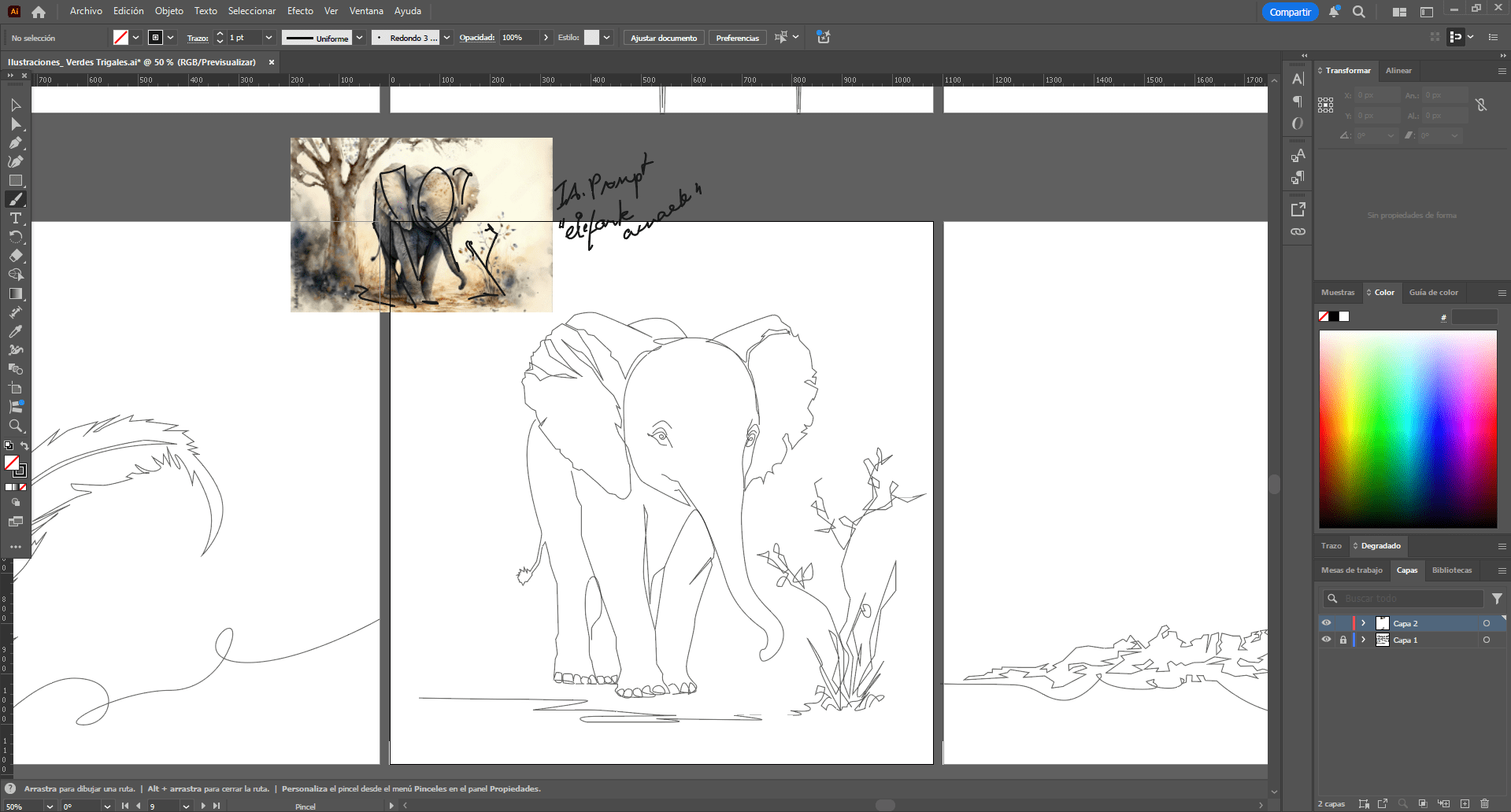
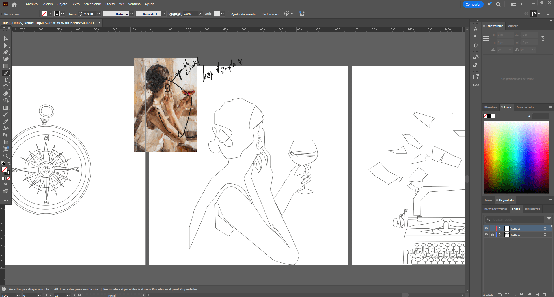
A cohesive editorial piece that combines expressive colour fields in the cover and chapter openings with minimal line-based illustrations throughout the book. This contrast between solid shapes and delicate lines creates visual depth while preserving clarity.
The use of warm tones and intentional white space reinforces the emotional quality of the texts, encouraging a slower, more reflective reading experience.
Specifications
115-page publication structured around both narrative flow and timeline, with chapter titles and layout contributing to the storytelling. Designed in Adobe InDesign and Illustrator. The editorial approach was guided by three core principles: contrast, simplicity, and delicacy, shaping both the visual language and content distribution.
Title set in Helvetica for a clean, contemporary hierarchy, contrasted with Times New Roman for body text to enhance readability for print format of the content.
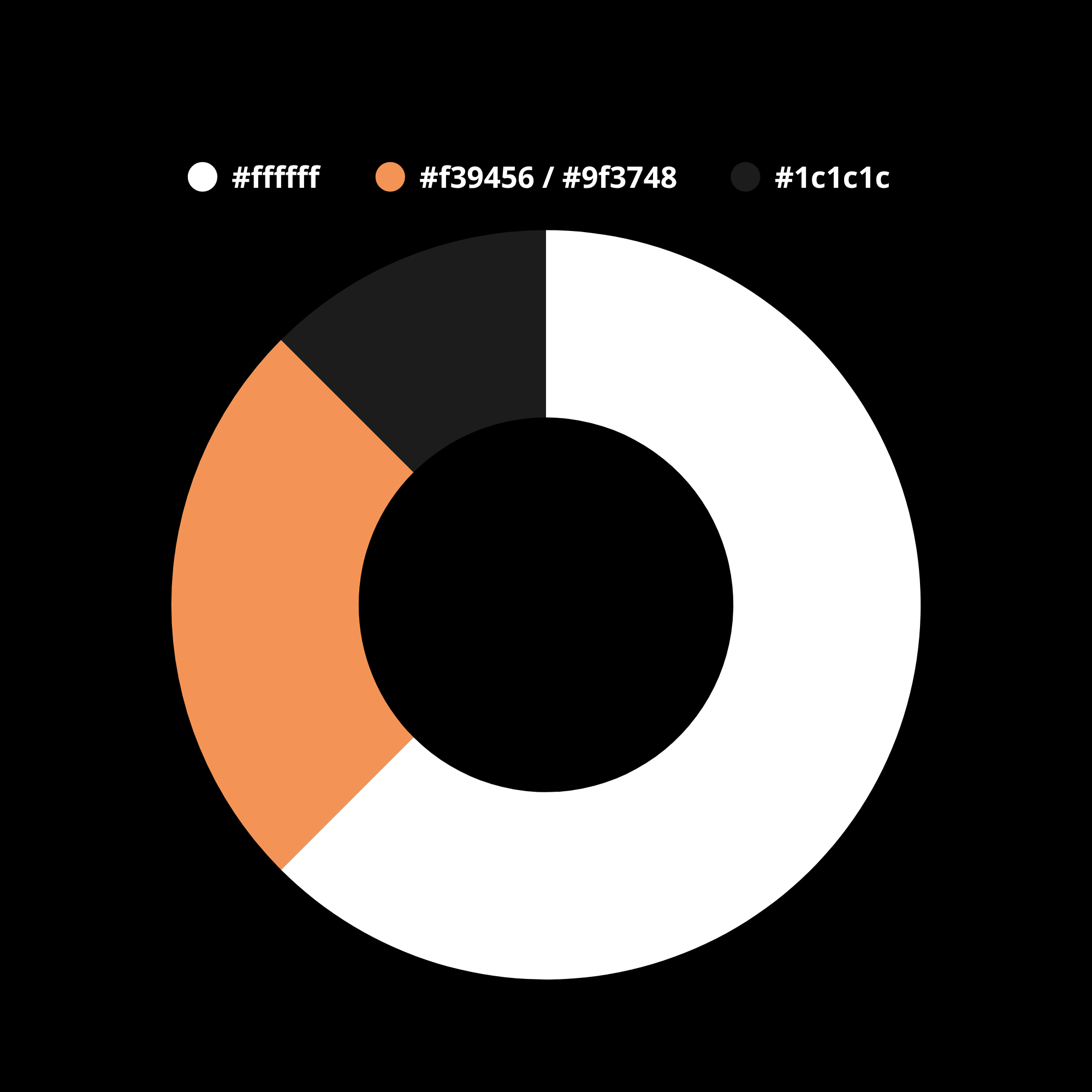
A 60–30–10 color distribution was used to establish visual hierarchy: a dominant neutral base, a secondary supporting tone for structure, and a bold accent color for chapters and cover.